The Heatwave Palette: How FOMO's Charcoal, Burnt Orange, and Lime Stand Out in Tampa
By Team FOMO · 4 min read · Updated May 8, 2026
Walk down any food row in Tampa right now and you'll see the same palette on repeat — warm neutrals, wellness greens, soft beige, hand-lettered cursive. It's tasteful. It's also forgettable. We picked the opposite on purpose.
Charcoal: the anchor
Charcoal grey is the foundation of everything FOMO. It's the body of the truck, the dominant tone of the lot at night, the background of every photo. Charcoal reads premium without being precious — it lets the food and the lights do the talking.
Most casual restaurants are afraid of dark colors because they think 'casual' has to mean 'bright.' We disagree. Casual means easy to be in. Charcoal makes everything sitting on top of it pop.
Burnt orange: the brick oven
Burnt orange is the heart of the brand because it's the heart of the menu. The brick oven. The char on the naan. The marigold and saffron tones that run through Indian visual culture.
It's the warmth in the brand. When you see burnt orange on a FOMO touchpoint, you're seeing a direct line to the kitchen.
Electric lime: the energy
Electric lime is unreasonable, and that's the point. It's the glow of the arch you see from the road. It's the freshness of mint chutney. It's the energy of a Friday night at 9pm.
It's also the signal. When a customer sees lime, they know we mean it — a drop, an event, a thing worth showing up for.
A pattern interrupt at 60 mph
The whole palette was built for one job: get noticed in a saturated city. North 40th Street has a lot going on. The combination of dark charcoal, burnt orange and a single dose of electric lime cuts through at driving speed.
It's not just branding. It's wayfinding. It's why people remember us, and why they can describe us to a friend without ever knowing the name.
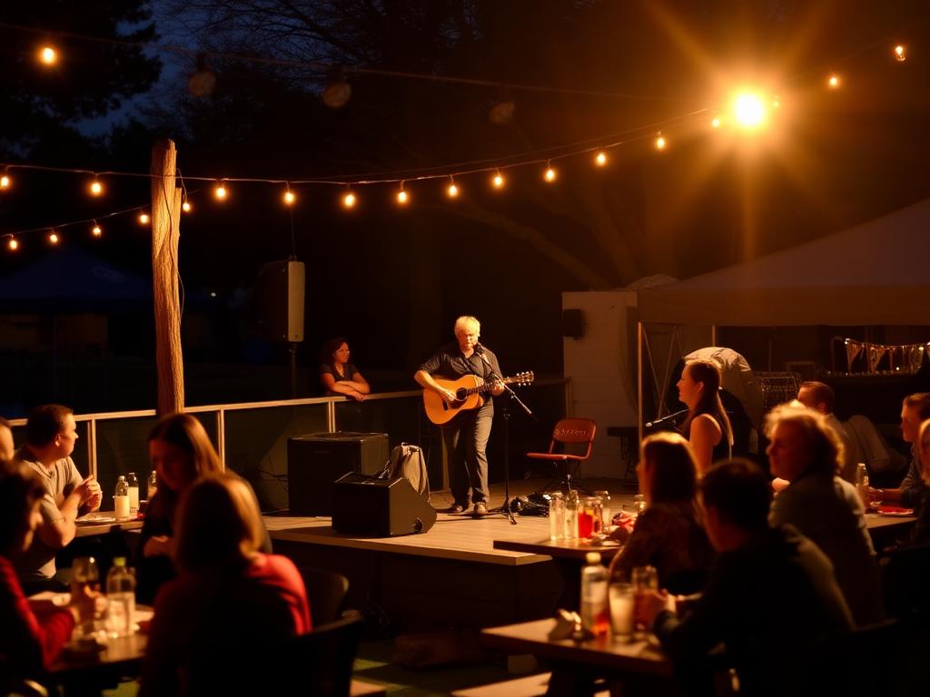
Pull up after dark. The palette is meant to be experienced, not described.